Building a luxury clothing marketplace
context
This project is a high-standard clothing marketplace, initially focused on female customers, aiming to bring the high-quality fashion standards of the southern hemisphere to the northern hemisphere.
The client faced significant challenges with the checkout experience and a lack of persuasive elements (bias) within the marketplace to encourage purchases. Our goal was to solve these problems and elevate the overall user experience.
ROLE
UX/UI Designer
TIMEline
1.5 months
Activities
PROBLEM SPACE
However, the marketplace was built on a whitelabel e-commerce platform, which limited the customization capabilities. As a result, the user experience was subpar.
The checkout process was confusing, overloaded with information, lacking proper information architecture, and provided a poor user experience.
The marketplace lacked the necessary persuasive elements (biases) to encourage customers to explore and buy the products being offered.
OBJECTIVES
Introduce cognitive bias strategies to encourage product exploration and increase purchase intent. We aimed to drive conversions and create a sense of urgency.
Redesign the process to be intuitive, fast, and frictionless, enabling customers to complete their purchases while improving overall satisfaction and reducing abandonment.
process
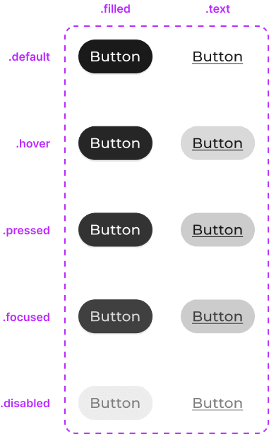
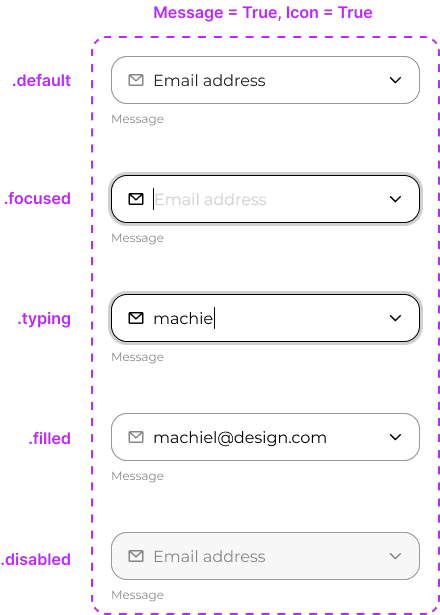
Visual Foundation:
Before starting the project, we needed to establish the visual identity. We created the color palette, typography, and foundational UI components to ensure consistency and a premium aesthetic.

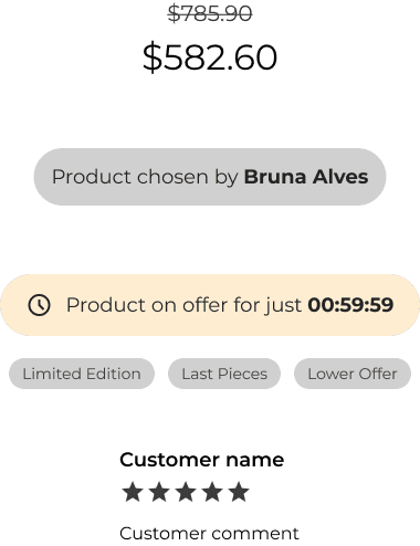
Persuasive Bias Components:
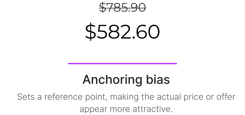
Every e-commerce platform must tap into the users' cognitive behaviors and decision-making processes. For this project, we implemented components designed to leverage key cognitive biases.


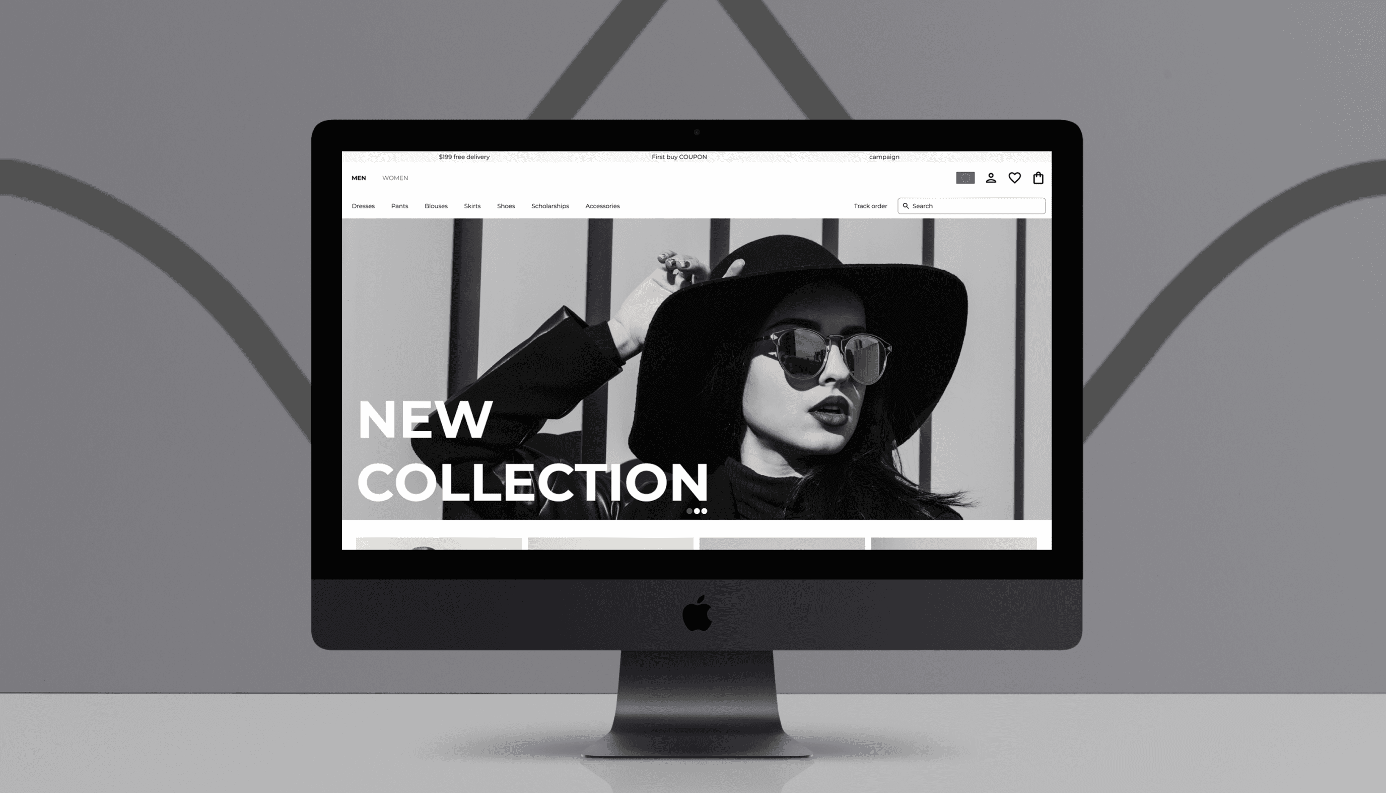
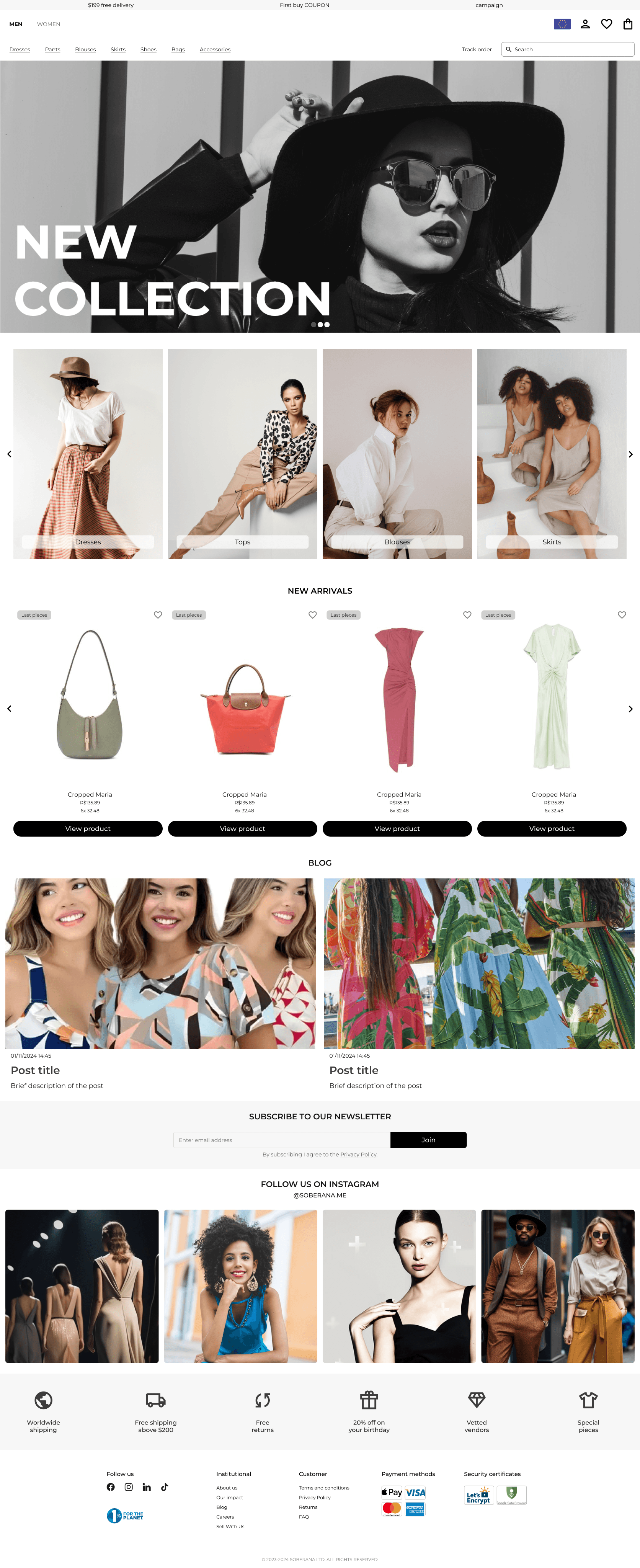
Homepage:
The homepage design prioritizes large, high-quality imagery, featuring product categories and curated product highlights to draw immediate attention.
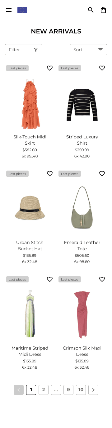
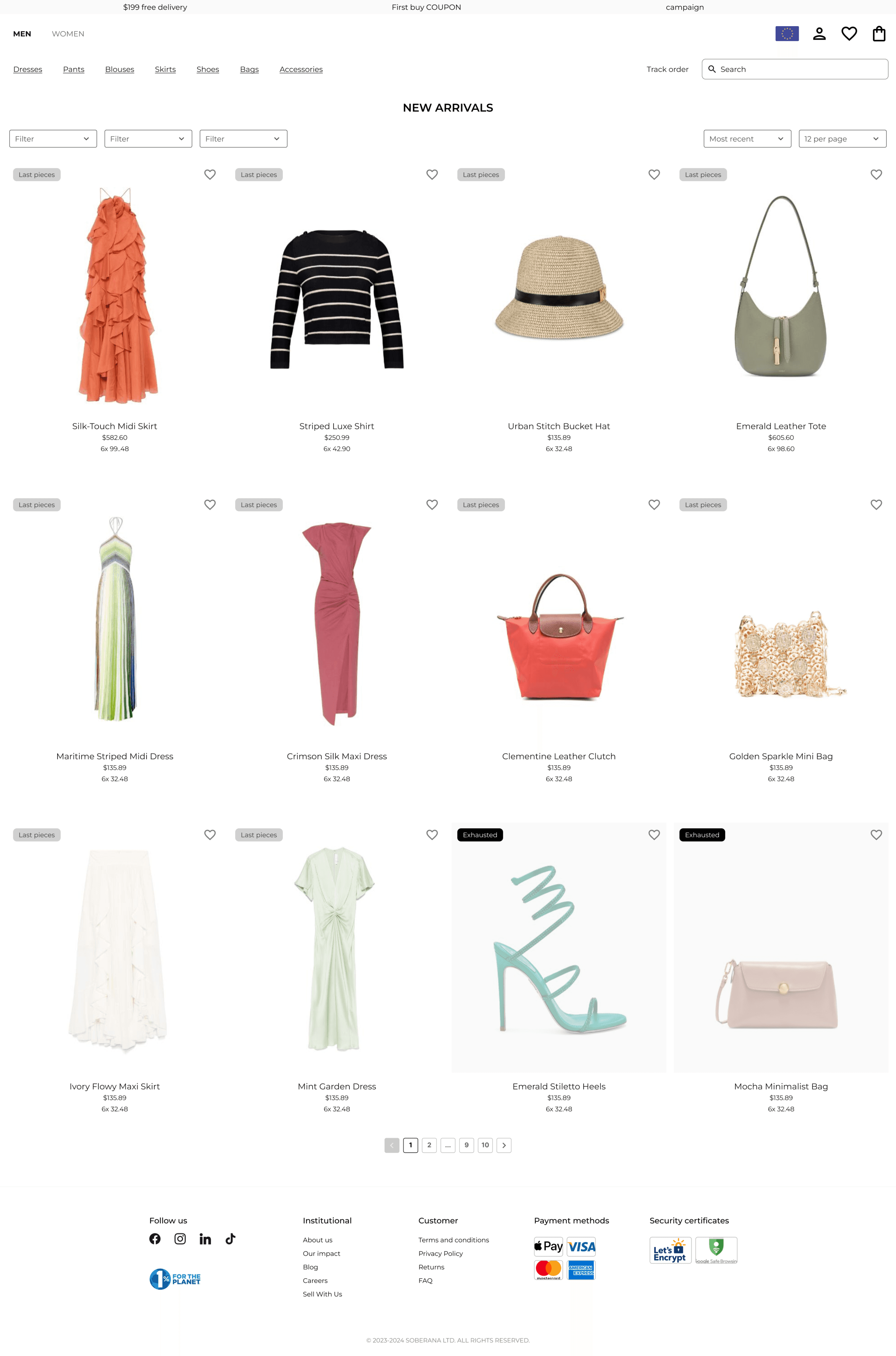
Product Listing Page:
We applied anchoring bias and scarcity bias to create a sense of urgency and value while maintaining a strong visual focus on the products.
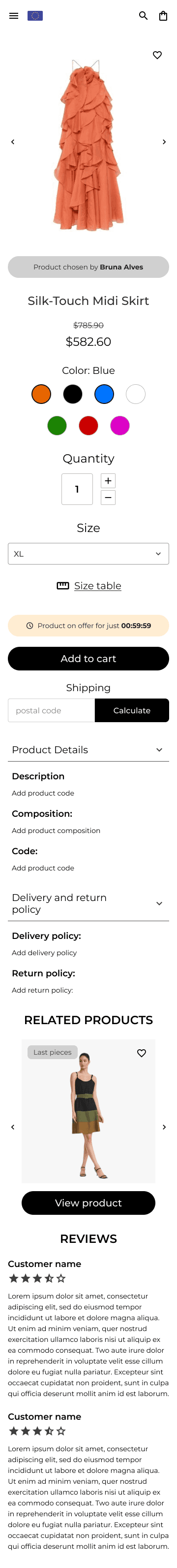
Product Page:
The product page was designed to provide comprehensive information about the product, including the product’s descriptions, recommendations (cross-sell), similar products and user reviews.
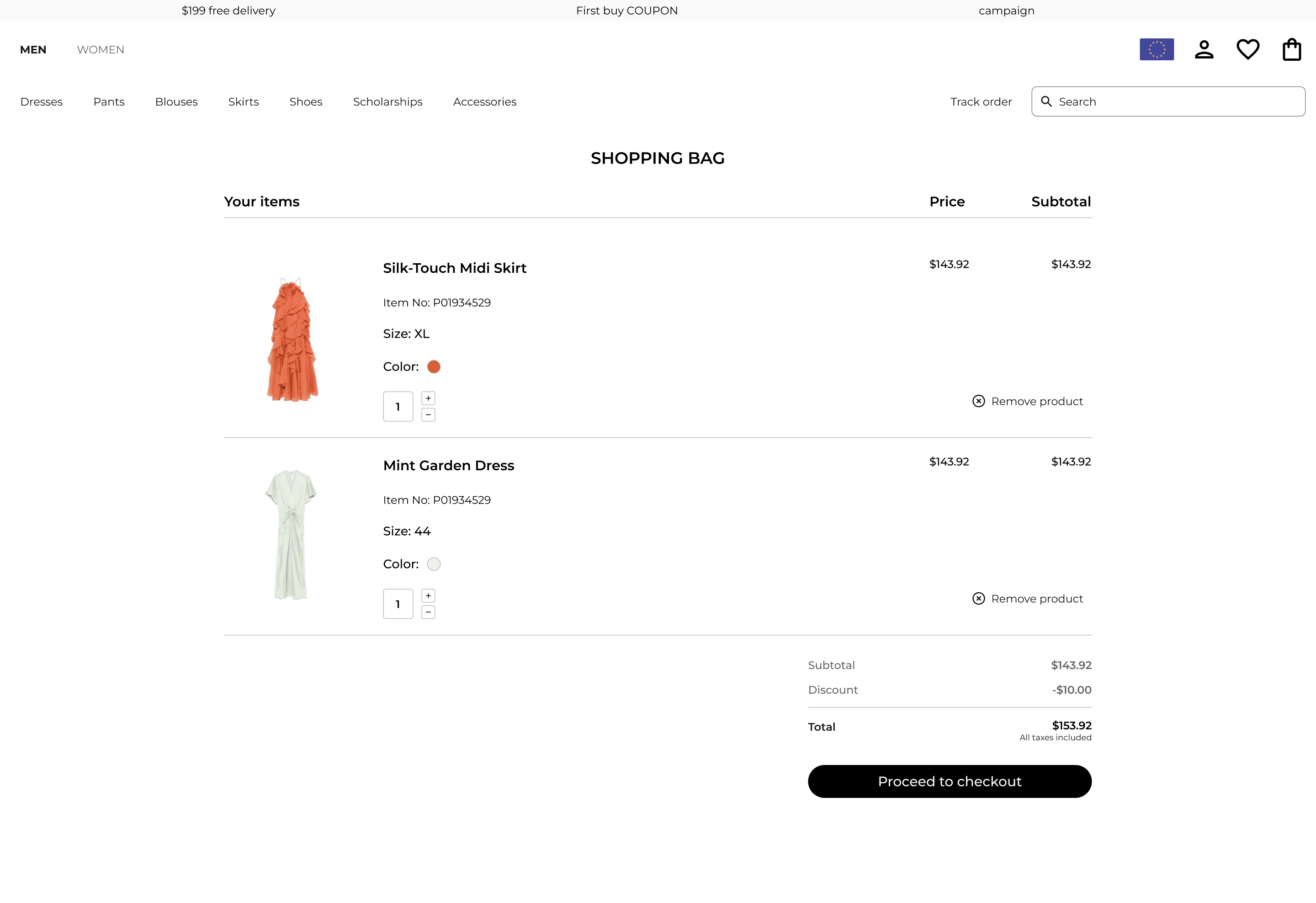
Checkout:
The checkout process was redesigned from scratch with a focus on simplicity and speed. The goal was to enable customers to complete their purchases quickly and effortlessly, reducing friction.

NEXT STEPS
Project Launch:
This project isn’t on air yet. So the results are not available.